Cover Story is a curriculum focused on writing, but we provide a bit of guidance in the area of magazine layout and design as well! We encourage every student to share their magazine with friends and family, whether that’s in print, handwritten, or in an e-publishing format!
Though good content is key, how it is presented to the reader has an impact on how they will receive it. Sometimes content is even passed over or ignored because it is visually difficult or boring to read.
Design Principles
HERE ARE SOME BASIC PRINCIPLES THAT WILL QUICKLY IMPROVE ANY LAYOUT:
Dominance / Contrast
 More important elements should be larger.
Make the dominant element–whether a graphic or a text heading–quite a bit larger, not just a little bit larger, to create greater visual contrast and interest.
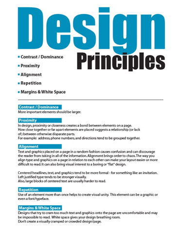
The “after” example at the bottom of this page immediately pulls your eye to the most important thing: the subject matter of the information sheet. You know right away whether or not it is something that is relevant to you and if you want to keep reading. Plus, it looks cooler!
Proximity
 Proximity, or closeness, creates a link between elements on a page. How close together or far apart elements are placed suggests a relationship (or lack of) between them.
For example:Address, phone numbers, and directions tend to be grouped together.
- A listing of the benefits of a particular product are usually together (as opposed to scattered in different parts of the page or ad).
Alignment
 Text and graphics placed on a page in a random fashion causes confusion and can discourage the reader from taking in all of the information. Alignment brings order to chaos. The way you align type and graphics on a page in relation to each other can make your layout easier or more difficult to read. It can also bring visual interest to a boring or “flat” design.
Imagine a border of space around the edges of your page. This should stay consistent when placing elements next to that imagined “edge.” For example, don’t have some text lined up 3/4″ from the edge, and some lined up at 1″. It will look like it’s been placed randomly, and disrupt the visual pathway for the eyes to follow around your page.
- Centered headlines, text, and graphics tend to be more formal – for something like an invitation.
- Left justified type tends to be stronger visually.
- Also, large blocks of centered text are usually harder to read.
Repetition
 To create visual unity use an element more than once. This helps to create a link between different parts of the page so that the viewer sees it as more of a whole instead of a bunch of disjointed pieces.
You can repeat shapes, fonts or even a specific color.
A Word About Fonts!
Don’t use fancy fonts for the body text of your project. These fonts are hard to read. These are sometimes okay for headings and titles since their larger size makes them easier to read.
You normally shouldn’t use more than three different fonts. Using several different fonts makes everything look random and greatly weakens the unity of the design. If you want something to stand out more, consider making it bolder, larger, or a different color instead of adding another typeface.
Another font tip: Cursive or “fancy” fonts should rarely, if ever, be used in all-caps.
White Space
Don’t create a visually cramped or crowded design/page.
Designs that try to cram too much text and graphics onto the page are uncomfortable and difficult to read. White space gives your design breathing room and helps the viewer’s eyes to flow more easily from one thing on the page to another.
Make sure your margins are generous. Do not let text run close to the edges of the page – unless you’re doing it for a very specific reason. Photos and graphics can “bleed” off the page, however.
Bleed (definition):
When any image or element on a page touches the edge of the page, extending beyond the trim edge, leaving no margin it is said to “bleed.” It may extend off one or more sides.
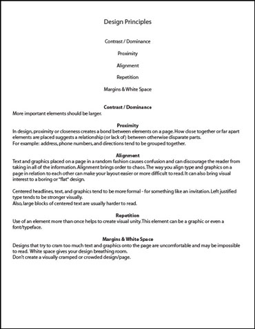
Now it’s YOUR turn. See if you can take the text below and arrange it in a visually pleasing manner using the Design Principles. It does NOT have to look like the “AFTER” example on the right. Designers bring their own creative flair to a project even when using the same “tools” as others.
Click the images to see a larger version:
All the information is here. But everything on the page looks the same which makes the page bland and harder to read. People are likely to skim, miss important information, or ignore it altogether.
Compare it with the design on the right.
The same information is included. But some simple design principles have been employed to create something more enjoyable to look at and easier to read.
Compare it with the design above. WHICH design principles did I employ?


